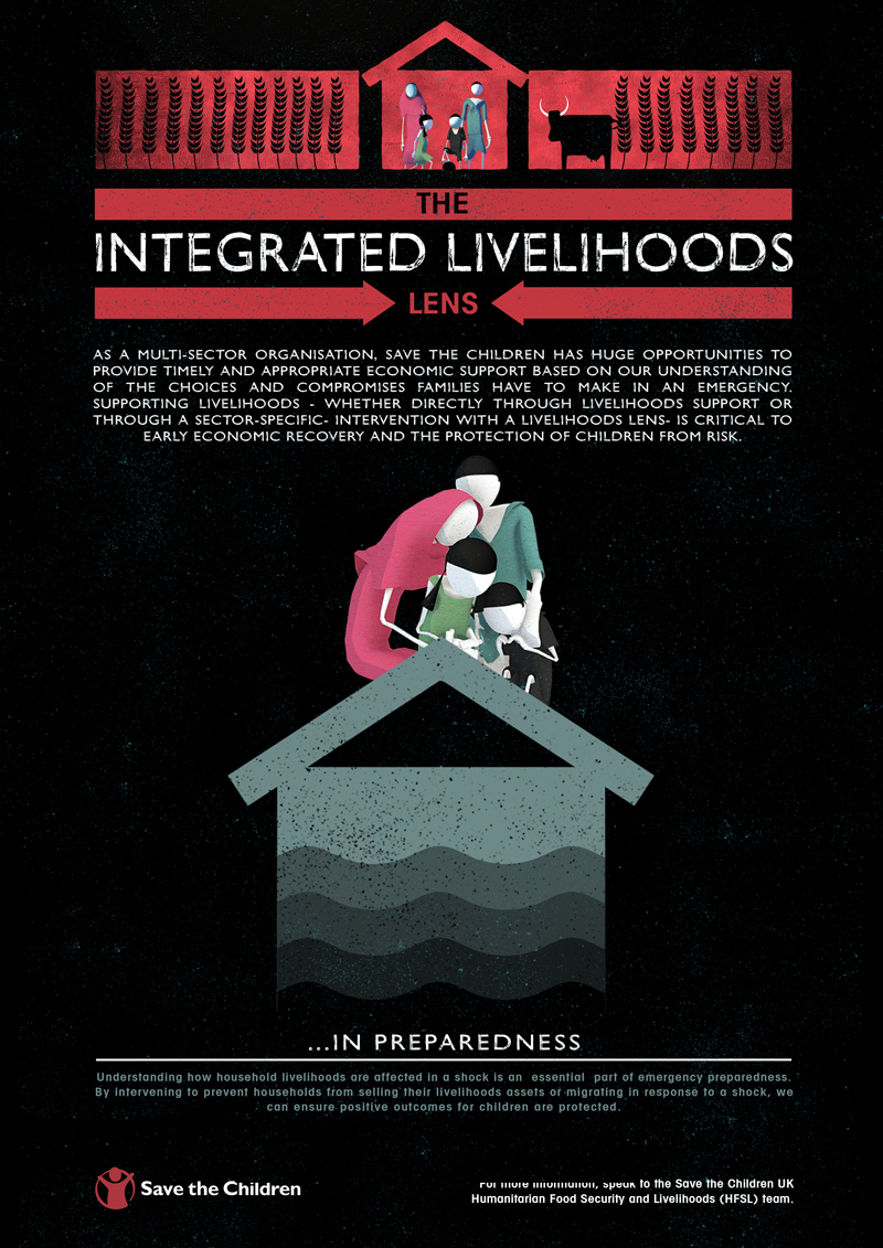
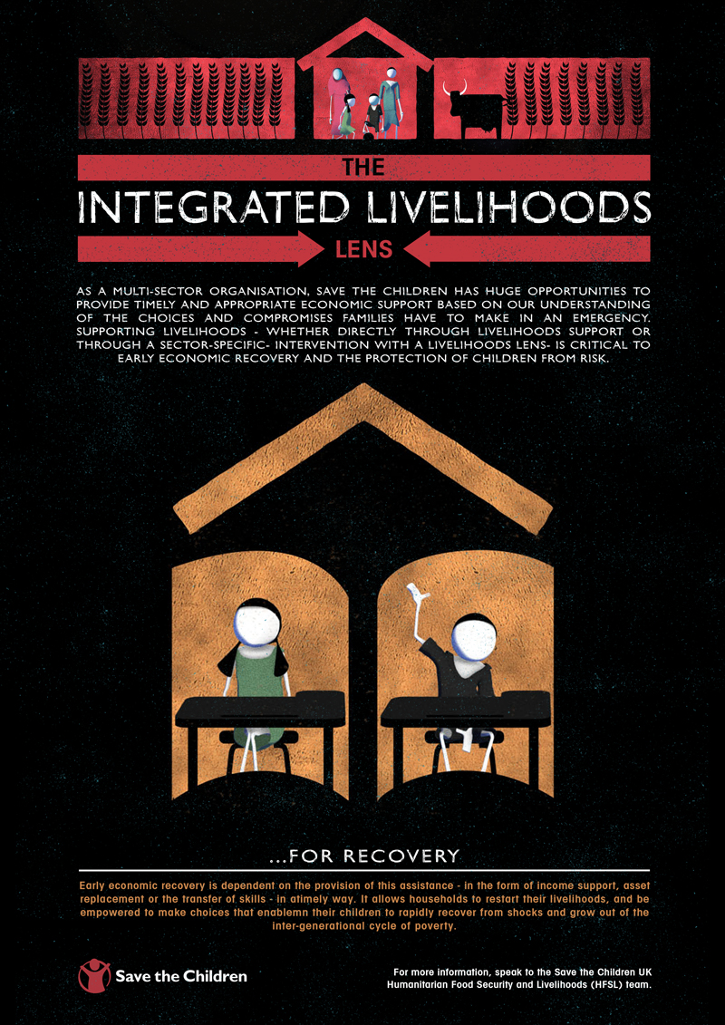
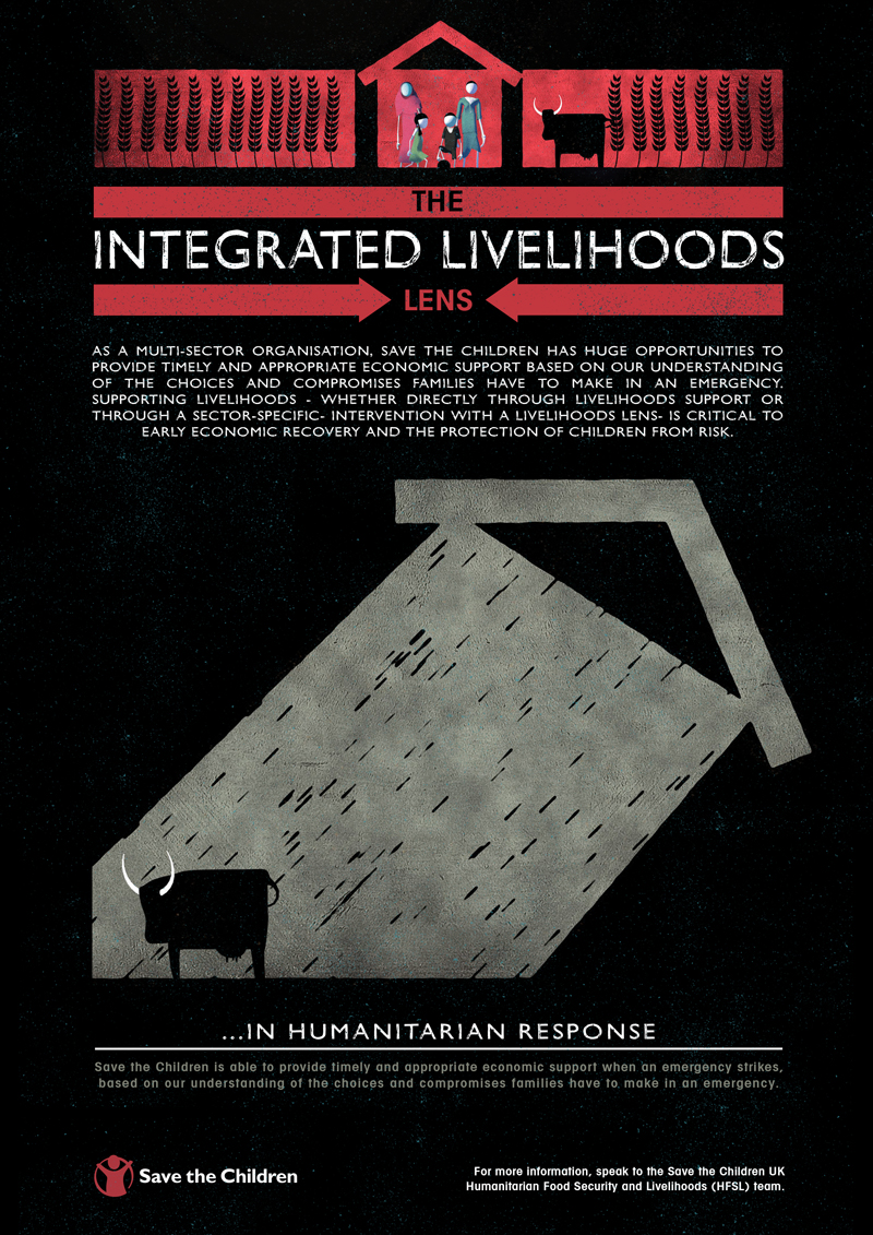
The target audience for this campaign were internal operatives within the Save The Children organisation. Since this audience were already very knowledgeable in the subject matter we embraced that, using the various humanitarian sector symbols utilised in the EU to frame the central focus , a family in need of aid. By inverting and turning the symbols meaning on their heads embellished the videos message – that individual sectarian responses do not always create a full and long lasting solution.
The characters were modelled and animated in 3D software so that fluid and real movements were easily captured, allowing for emotional connection to the subjects of the film. These were then rendered and stylised to fit within the more textural, earthy feel of the piece, indicative of the countries that the subjects are typically from. Then info graphic frames based on the humanitarian symbols commonly used by aid organisations [ see Concept Development ]. Different coloured backgrounds helped highlight the mood and tone of the film at that particular point, going from bright positive colours, to sombre tones and back again.


