

The client provided us with a clear brief to explain through animation the process of Crop Forecasting.
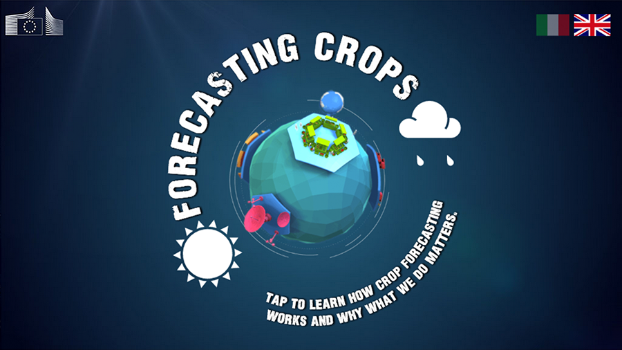
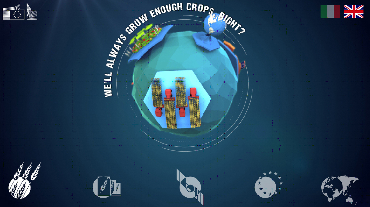
We created an interactive globe that had five sections that related to five questions that would be answered by each section. The user could swipe the screen enabling them to rotate the globe faster than it’s natural spin, allowing them to highlight each different section at their own pace. A menu of simple buttons on the bottom allowed the users to select that question and watch the accompanying animation.
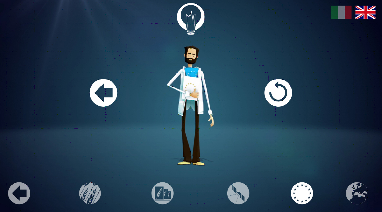
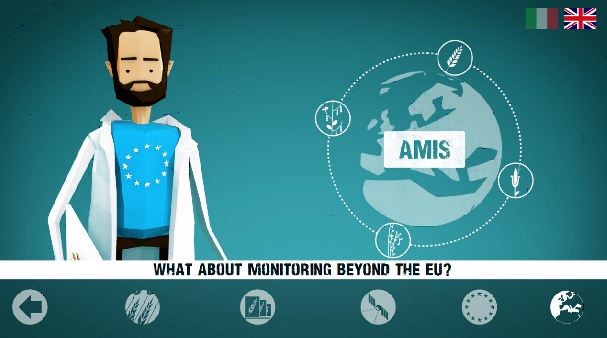
The animations were developed as a series of info graphics that were delivered in the form of a lecture. We created a scientist that was representative of the Joint Research Centre scientists. This gave an impression of a more personal tutorial with explanations rather than simply a series of facts being stated, to engage younger viewers and help them retain the information. Each animation ended with an interactive board with more options and ‘factoids’ – extra facts to enrich the users knowledge and experience.